Process Viewer
Before you use the Process Viewer, start the flow containing your Process Analyzer.
Create a Dashboard with a Process Viewer
You can integrate the Process Viewer into any existing dashboard. For this documentation, let's start with a fresh dashboard that contains a Process Viewer only.
Create a Dashboard
Go to the Dashboard Orchestrator, chose "New Dashboard" and give your new dashboard a name:

Create Space for the Process Viewer Component
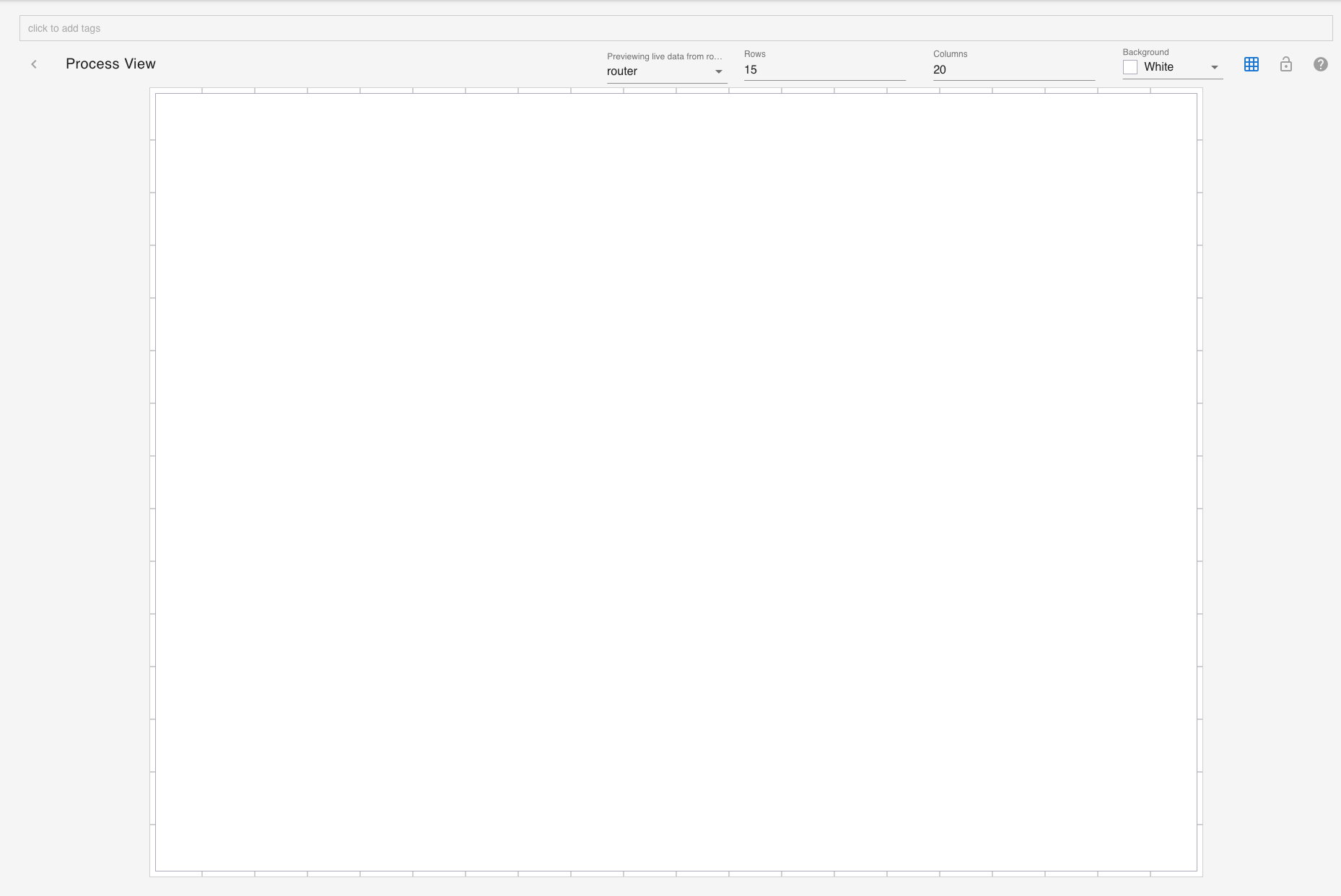
Select the whole dashboard with your mouse. This creates the space for your new component:
Select the Process Viewer Component
Click on the edit button at the upper right corner:

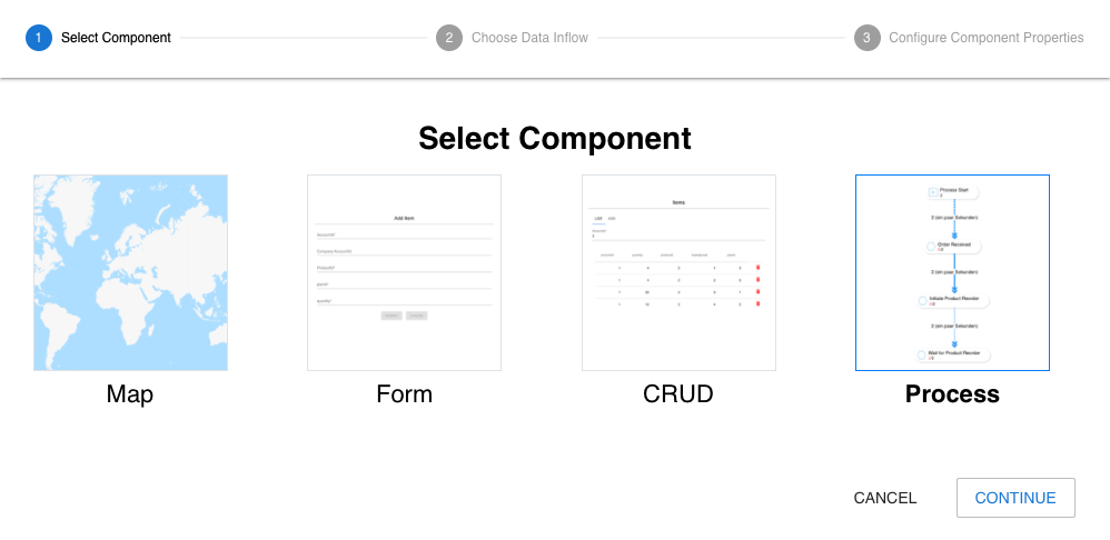
From the component selector chose "Process":
Configure it
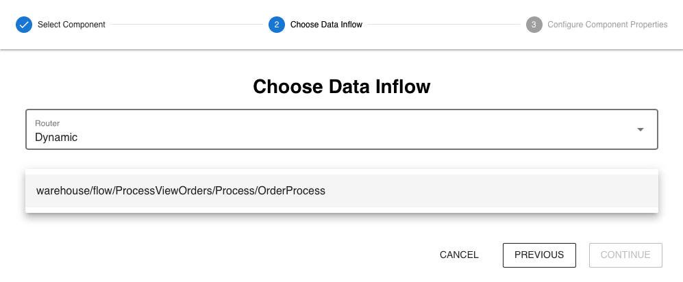
Chose the data inflow stream provided from the Process Analyzer flow:
Specify the title of the component:

See a live Preview
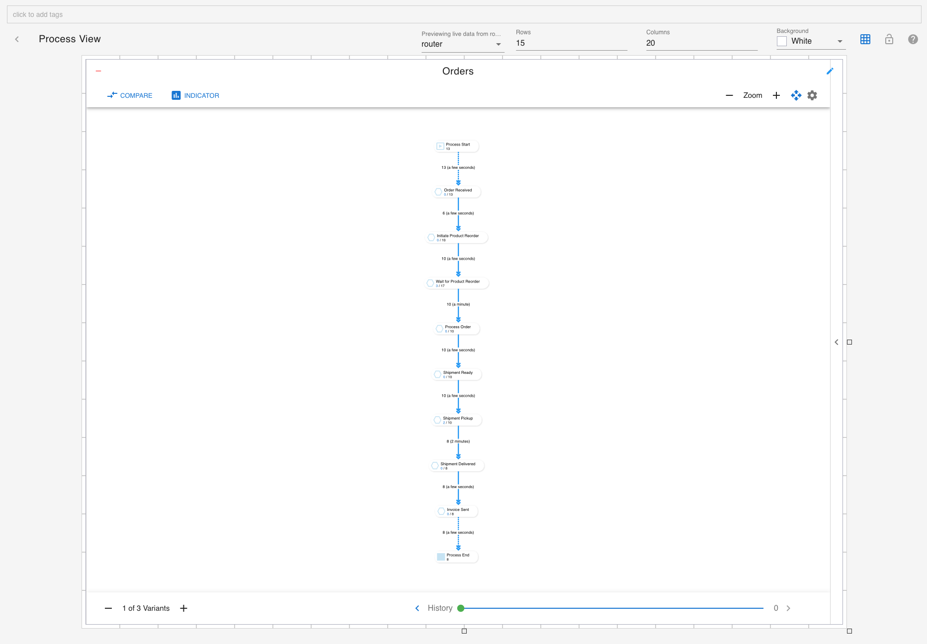
After you hit "Create" you'll see a live preview of the process:
Tag the Dashboard to display it under a Menu
To display it under a menu, specify a tag at the upper left tag box:
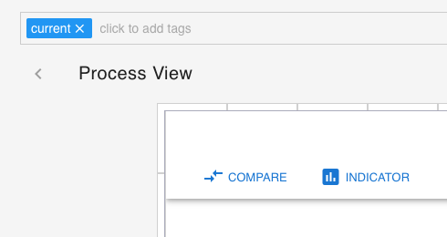
You need to create a menu (or use an existing one that matches your tag). Please have a look here: Create a Menu with Tag Selector.
The Process Model
The Process Viewer displays the live process model with animations of processes traveling from one stage to another.
Happy Path
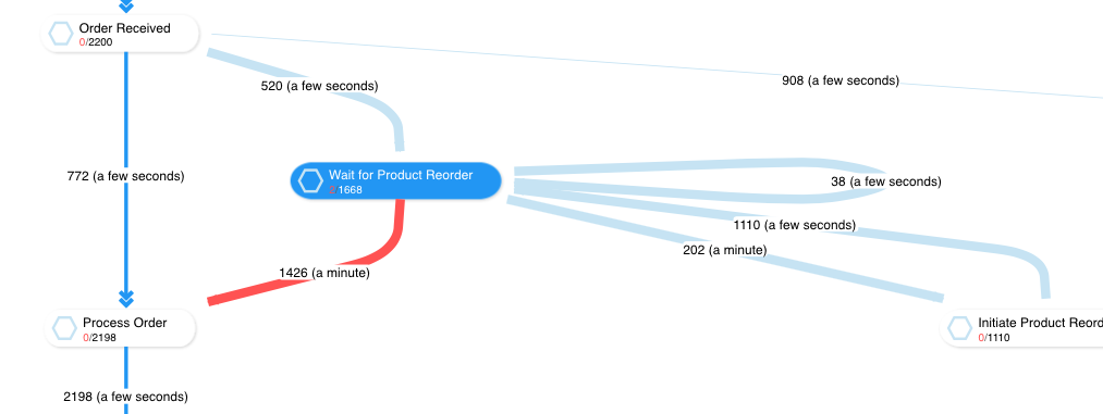
When the process model is initially displayed, it shows the Happy Path, defined as the path where most processes traveled. It is calculated by sum of total value / number of stages. The Happy Path shows in bold.

Stage Display
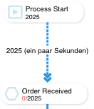
A stage displays the current and the total value below the stage name. The current value is displayed in red. Process Start, Process Expired and Process End display the total value only because no process can stay at these stages.
Link Display
Links between stages display the total value that has traveled this link and the average delay it took from the source to the destination stage:

Total Count and KPI Selection
The Process Viewer per default displays the total count of processes and builds the path weight from that. To change it to a KPI value (if defined), select it here:
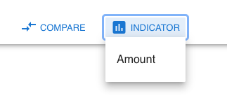
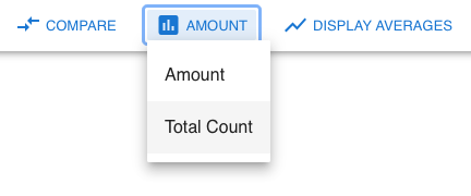
Once selected, you can switch between the raw value of that KPI and the average:

To switch back to the total count, select it here:
Variants
The number of variants is shown at the bottom left. The first variant equals the Happy Path. To display more or fewer variants, click on the + or - button.
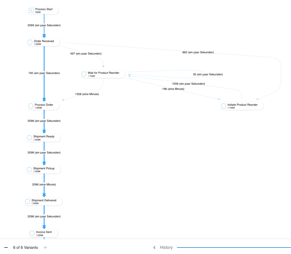
Process mining is used to analyze why processes deviate from the Happy Path and optimize it accordingly. In the above example, we can see that many orders are processed late because they initiate reorders and wait for product availability. The reasons can be that the racks are too small to store more products, the producer cannot produce the demanded amount of products, or the delivery of the reorder takes too long. In any case, this is now a known issue and can be addressed.
Path Filter
The Process Viewer's right side contains a sliding panel where you can filter the paths to display with the list entries ordered descending by their weight. Only the selected paths are displayed, and the Happy Path built according to the selection:
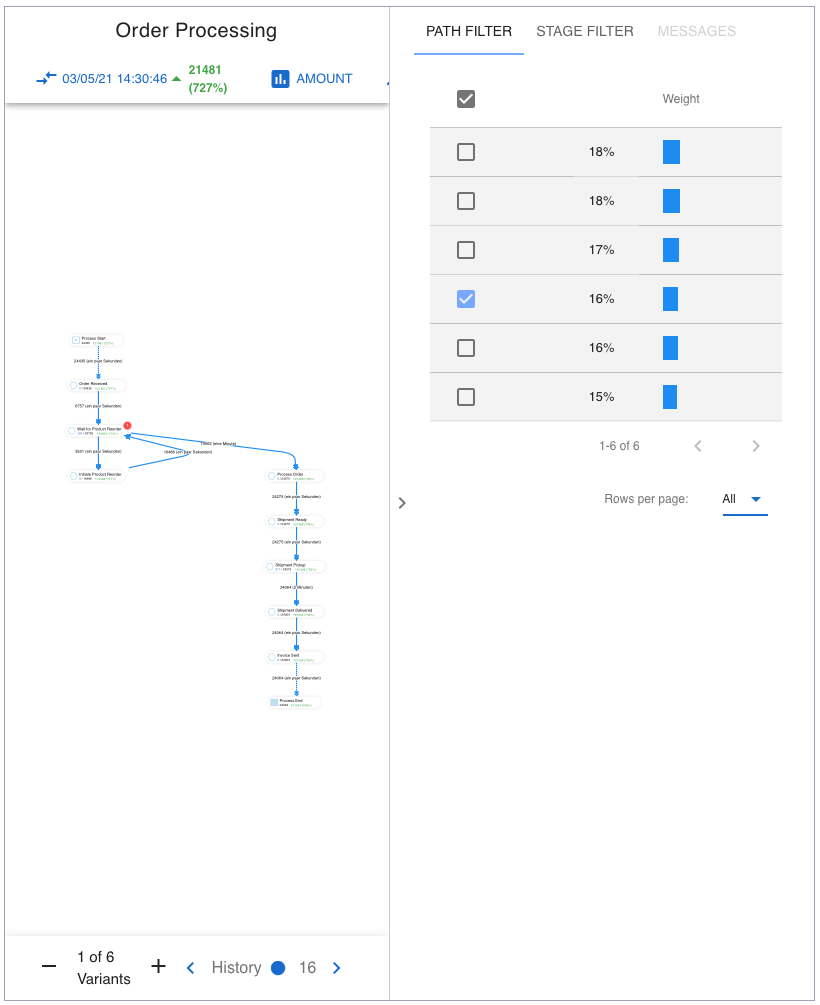
With this, it is possible to analyze a single path or a subset thereof.
Stage Filter
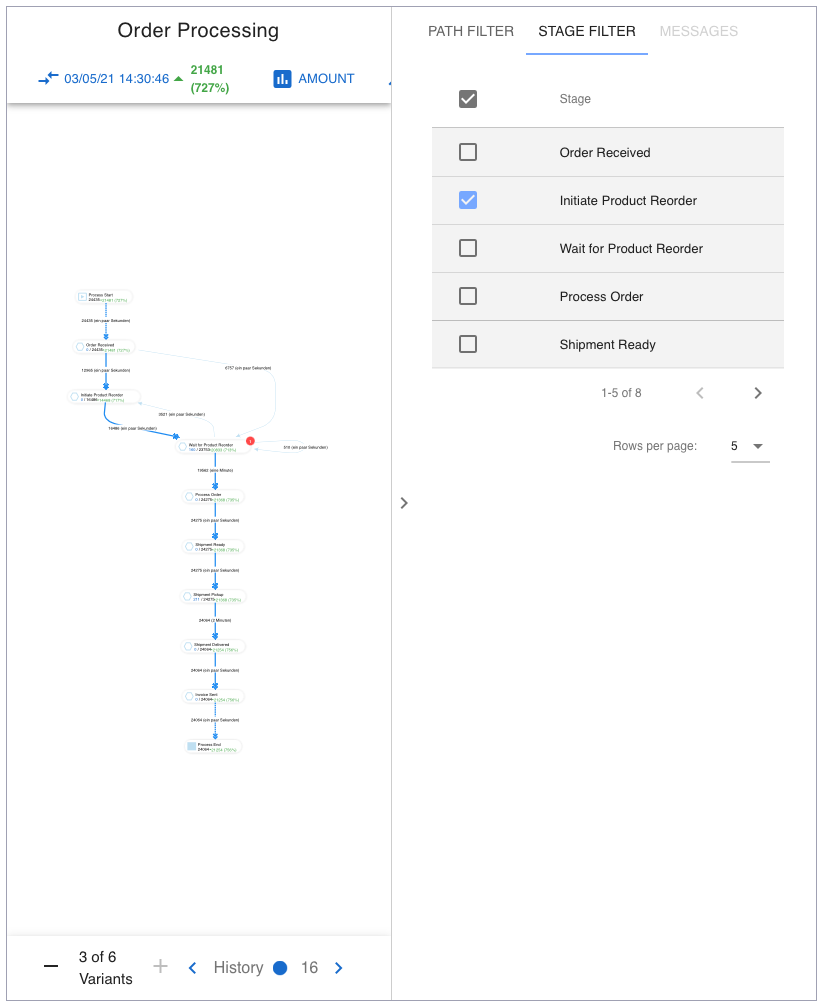
Use a stage filter to show only those paths that contain the selected stages. This is handy if you have many paths:
Alerts
If the Process Analyzer defines a time threshold for stages. By reaching this threshold, a stage displays a red badge with the number of late processes:

View Stage Messages
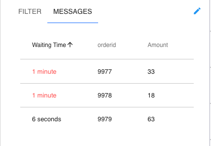
The right panel slides in and displays all waiting processes (maximum 100) with their corresponding waiting time at this stage by clicking on a stage. The time is updated every 30 seconds. If the Process Analyzerdefines a time threshold, it shows late processes in red:
Show connected Links of a Stage
If you click on a stage, all connected links of this stage are shown:
Zooming and Fit to Screen
The upper left contains the zooming buttons and the fit-to-screen button. You can zoom in to a process model and pan it around. Clicking on fit to screen displays the whole model with the selected variants:

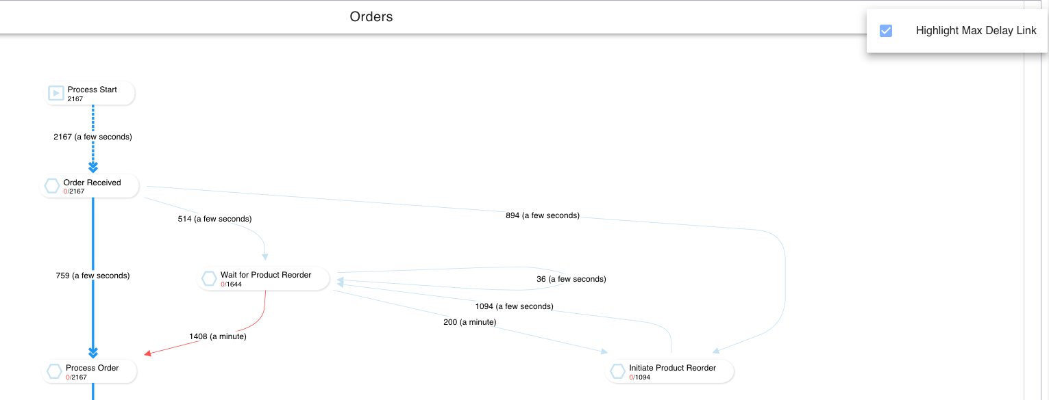
Highlight Link with maximum Delay
The upper right corner contains a settings button that displays a menu:

Click on Highlight Max Delay Link to red light the link that has the maximum delay of the currently displayed variants:
Snapshot History
Process Analyzer creates a snapshot of the current process model every 15 minutes for a maximum of 10 days in history (rolling, from now). You can easily slide to the snapshots at the bottom right of the Process Viewer. The outer right is the live model and shown in green. If you go left, you go through snapshots shown in blue. During sliding, a bubble displays the date/time of the snapshot. The right number is the number of stored snapshots (maximum 960 = 10 days).

Compare with Snapshots (Benchmarking)
You can easily compare your live view or a given snapshot with another snapshot.
Compare Live with Snapshot
Move the history knob to the outer right position until it shows the green circle:

Now select Compare at the upper left:
It shows a window to select the snapshot:
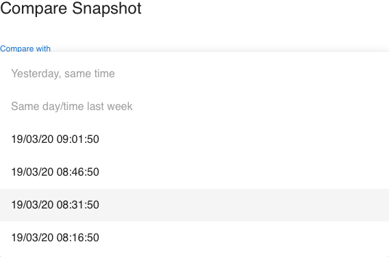
Yesterday, same timeSame day/time last week
These are rolling comparisons that dynamically select the snapshot of that time and adjusts it as time moves on.
<snapshot date/time>
This is a static selection that does not change, even when time moves on.
Compare Snapshot with Snapshot
Move the history to any snapshot and select Compare to compare it with another snapshot.

KPI Display
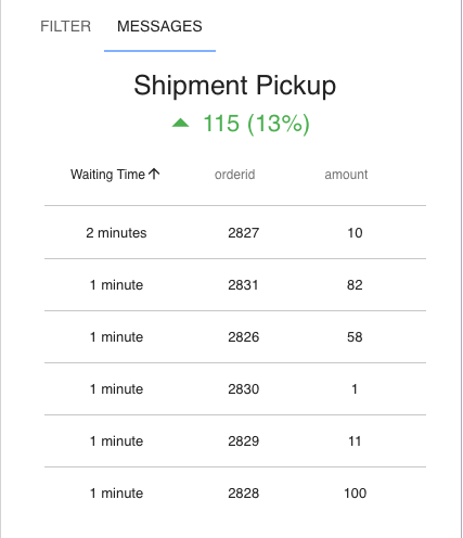
Once you have selected a snapshot to compare against the live view or another snapshot, you'll see the KPI display in total and percent difference.
This is displayed at the top for the whole model:

At stages:
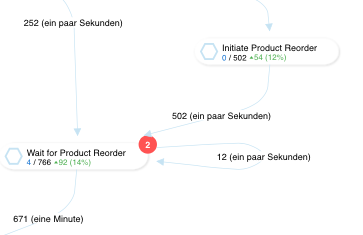
In the message pane, when you select a stage:
Combine Process Viewer with other Dashboard Components
Recap of the Process Analyzer flow:
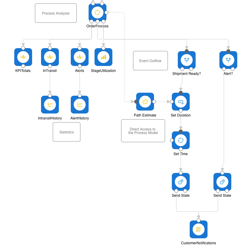
It produces the totals and the stage utilization statistics. Add these to a dashboard as probes, area, and group chart components:
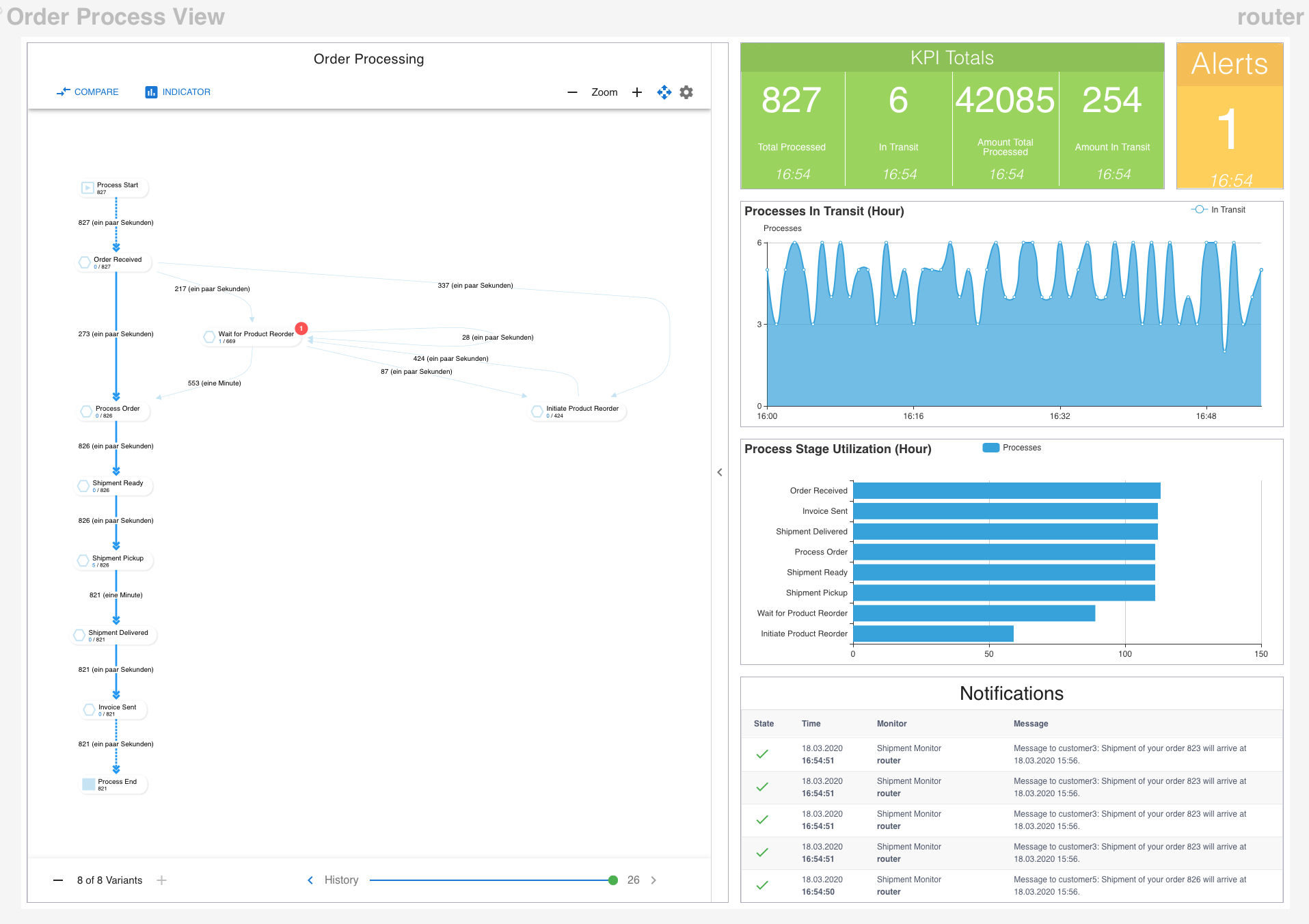
And, of course, you can add any other dashboard component from any source you want.
